Overview
Audyssey’s MultEQ is a desktop audio software that allows users to calibrate their speakers and customize their listening experience. With the functionality of this software in place, Audyssey Laboratories sought out a team of 4 UX/UI designers to improve upon the information architecture and UI of their application to provide a better experience for new and returning users.
Role/Tools/Client/Project Type/Timeline
UX/UI Designer alongside 3 other designers
Figma, Google Sheets
Audyssey Laboratories
Desktop Application Redesign
2 Months: February - March 2021
Project Objectives
1.) Users need to be able to tell which section of the application they are currently working in, as well as whether they can freely move forward or backwards with their information being saved.
2.) New users need a guided experience to discover MultEQ’s features and create audio configurations, while existing users need the ability to review and modify previous configurations.
3.) A consistent UI style for each component needs to be defined throughout the application to differentiate between the different actions they can take within each section of the application.
4.) A visually clear and logical hierarchy of information is needed to reduce the obfuscation of information throughout the application.
5.) Language throughout the application must be consistent. Additionally, technical language and abbreviations must be kept to a minimum.
Unique Challenge
Our design team had little to no experience with audio software and we lacked access to the hardware used for the application’s sound calibration process which stood as the application’s backbone.
To tackle these challenges, my team and I had to quickly familiarize ourselves with the main goals of the power users of technical audio software, as well audio terminology to create the best possible end product for Audyssey Laboratories’ users.
Technological Constraints
1.) Adherence to Microsoft’s Fluent Design System
2.) Microsoft/Windows UI paradigm, fat client
3.) UI under the constraints of two UI libraries and frameworks Xamarin.Forms and SyncFusion.

Existing Application Screenshots

Existing Application Screenshots

Existing Application Screenshots

Existing Application Screenshots

Existing Application Screenshots

Existing Application Screenshots

Existing Application Screenshots
Heuristic Evaluation
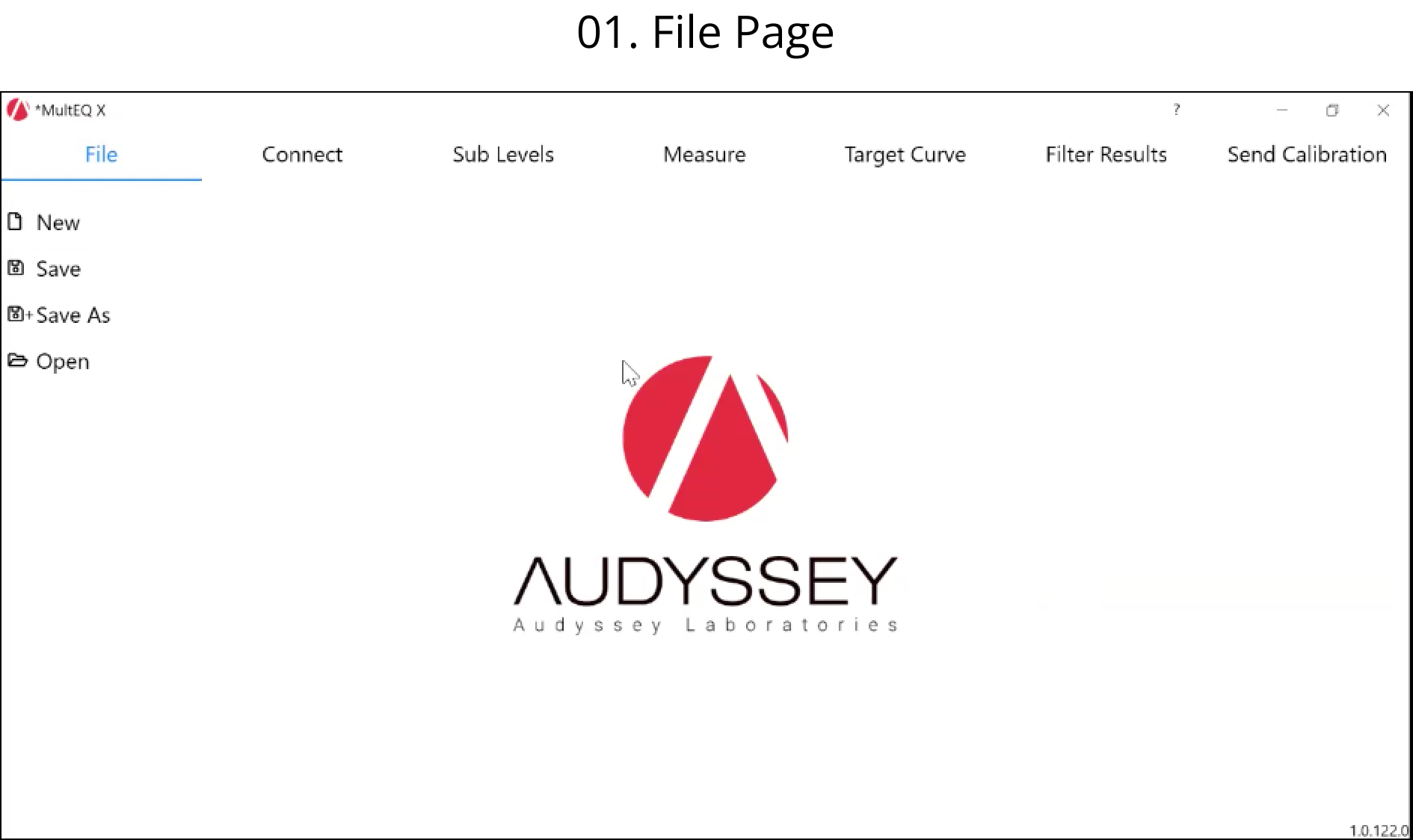
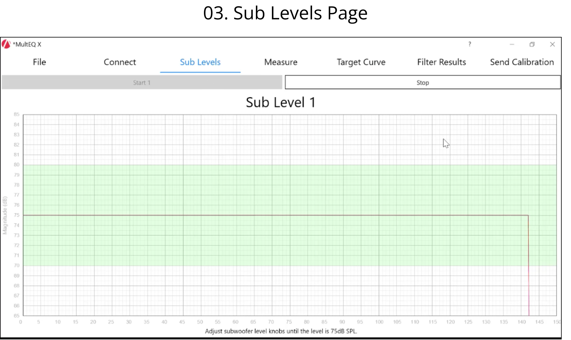
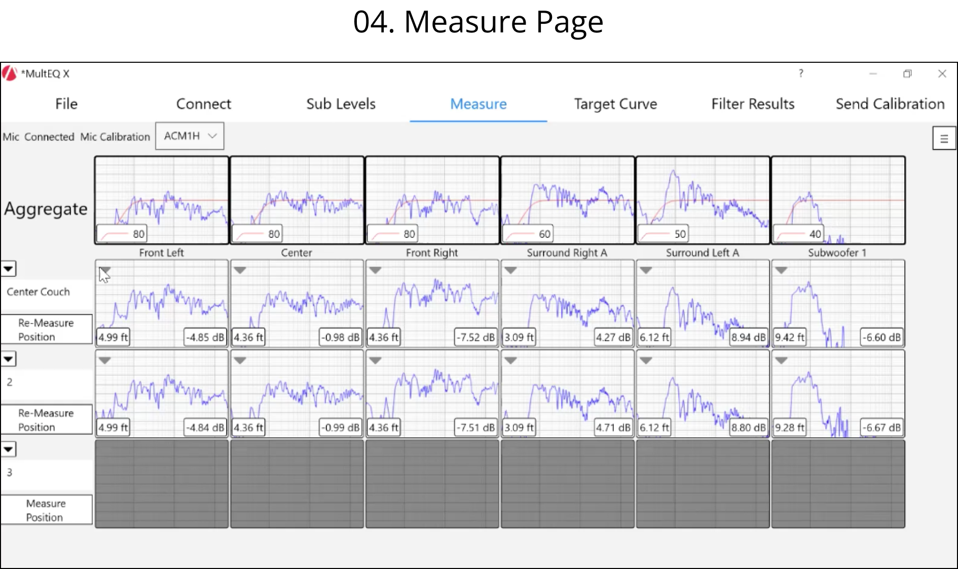
To begin our application redesign, our team created an identical prototype of the existing application through a series of interconnected screenshots in Figma we gathered from a recorded application demo. Next, since the timeframe of our redesign didn’t allow for user research or testing, our team decided to conduct a heuristic evaluation of the application in its current state based off of Nielsen’s 10 Usability Heuristics shown below.
Key Findings
After conducting the review on an individual basis, our team combined findings and assessed their severity. The team found that the key pain points were related to navigation and discoverability.
Firstly, the app’s information architecture didn’t clearly show users’ progress through the audio filter creation progress - the main function of the application. This led to some confusion for the four of us and was particularly important as there was no onboarding education available for the app.
In terms of discoverability, UI inconsistencies represented a challenge - sometimes it was difficult to tell whether an element was just informational or interactive, and therefore the actions a user could take on each given page were unclear.
Discoverability was also made difficult by some inconsistencies in wording - i.e. different terms being used interchangeably - as well as the use of technical language and abbreviations users may not be familiar with.
Solutions
Using the results from our heuristic evaluation, our team determined the top-level UX and UI findings to present to the client. With feedback and go-ahead from the client, the team worked to resolve identified issues on the IA and UX/UI of the product. The solutions outlined below lead to our first round of wireframes for the client.
● Organizing and streamlining the flow users follow throughout the application.
● Implementing a progress meter and collapsible side menu bar to provide users with a consistent visual view of their progress within the application.
● Increasing spacing between data graphs to make them more readable,
● Adding colored gradients to delineate frequency cut off ranges on the Measure page graphs.
● Defining language consistency across the entire application.
● Implementing consistency across UI components including buttons, input fields, graphs, checkboxes, and sliders.
● Enhancing overall readability and accessibility with color and fonts.

Mid-Fidelity Wireframes

Mid-Fidelity Wireframes

Mid-Fidelity Wireframes

Mid-Fidelity Wireframes

Mid-Fidelity Wireframes

Mid-Fidelity Wireframes

Mid-Fidelity Wireframes

Mid-Fidelity Wireframes
Style Guide & High Fidelity Wireframes
Iterating upon the clients feedback on our first round of wireframes, with a focus on tackling the most severe UI issues found in the heuristic evaluation, our team created a style guide. Each UI component was styled consistently, adhering to primary and secondary colors, pseudo-states of common components, size, shape, positioning, and the declaration of a universal font. Our team also assisted the client with the creation of graphics and screenshots to be used on the Microsoft Store page to display their application. Alongside this style guide our team created high-fidelity wireframes as the final deliverable for our client.
Success Metrics
The success criteria for this project were subject to the needs of the client. The project was successful because:
1.) The information architecture and UI changes successfully addressed the top level findings of our heuristic evaluation.
2.) The client had the time and technological ability to implement newly proposed wireframes into their application.
3.) Our design team adhered to the proposed timeline.
Overall Learnings
1.) The heuristic evaluation was an invaluable tool for the team to learn what the user pain points might be and was particularly helpful as the project didn’t involve user research or testing.
2.) Business and technological requirements and limitations have a great influence upon final design decisions.
3.) Deciding upon a design choice and being able to stand by it with evidence as to why you made that choice is far better than ruminating over multiple smaller choices you could have made instead.


